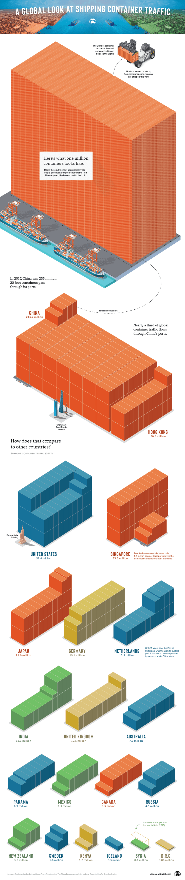
The following infographic is shared courtesy of Visual Capitalist
Rate this:
Share this:
- Email a link to a friend (Opens in new window) Email
- Print (Opens in new window) Print
- Share on X (Opens in new window) X
- Share on Facebook (Opens in new window) Facebook
- Share on LinkedIn (Opens in new window) LinkedIn
- Share on Reddit (Opens in new window) Reddit
- Share on Tumblr (Opens in new window) Tumblr
- Share on WhatsApp (Opens in new window) WhatsApp
- Share on Pinterest (Opens in new window) Pinterest
- Share on Telegram (Opens in new window) Telegram

Thanks Mike. Do we know SA’s number? Panama is a big copper country. I imagine quite a lot of that is transported in containers. What would be interesting are stats such as number found overloaded, number used for bulk commodities, breakdown by container type, number being used for housing, number of shipper-owned versus carrier owned.
Regards Chris Richards
Hi Chris, I believe South Africa sits between Panama and Australia. Glad you like the post. I will posting a similar graphic on container ports specifically, shortly. Take care, Mike